Monday, April 5, 2021

Going off-grid

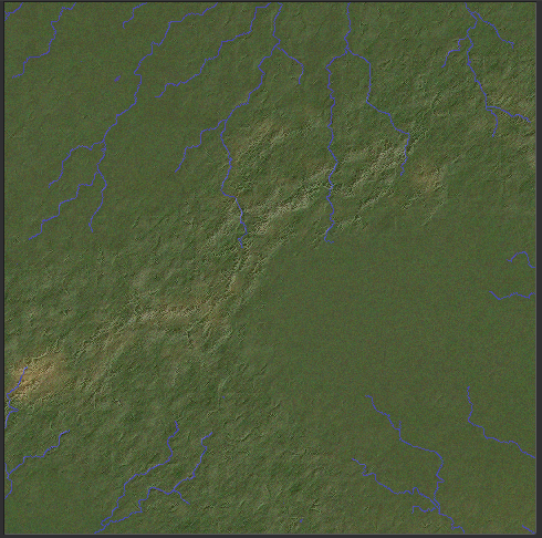
At the end of my last post I pointed out some grid-like artefacts, probably something to do with roughness. Here's a clearer look at them:


As it turns out, these have nothing to do with roughness, because I turned that off and they're still there. They're something to do with the rivers, because if I turn the rivers off, they disappear.

Part of the issue is the river valleys. If rivers are large and they have wide valleys, then these will often tend to have straight edges because even though the river wiggles about, those wiggles will tend to cancel each other out as far as the edges of the valley go. Still, I did find that there are quite a lot of straight river sections, so I spent some time adding extra routines to detect and remove these. They are working very nicely and the rivers are that much wigglier now, but it doesn't make much difference to these artefacts.

A simpler approach is just to add a routine that identifies long straight cliffs on the regional map and gets rid of them by pasting irregular-shaped areas of low/high land over them. That gives us this:


That is definitely a big improvement, but we do still have some grid artefacts remaining. Annoying, the use of the diamond-square algorithm to create detail on the regional maps does sometimes create artefacts of this kind. They don't appear all the time, but when they do they're quite annoying. What can we do about this?

I decided the best way to tackle this was to disrupt the terrain - just a little - with another source of detail. First, I created yet another global-scale fractal as part of the world generation process. However, this one gets some extra processing. First, I used a simple warp technique to distort the fractal. Basically, two additional fractals are generated. Then, going through the original, we look at each point in turn. We take the corresponding points on the other two fractals to shift the x and y coordinates on the original fractal, and copy whatever point we find there over to the original point. I did this twice, and got this rather nice marbling effect:


Definitely no bias towards vertical/horizontal lines there.

Now, at the regional level, we can use this to disrupt the terrain a little. After terrain has been generated, we go through each tile in turn. In each one, we sample a few random points. For each one, we compare it to its neighbours. If the height difference between them is above a certain threshold, we take a random small circle of that noise map and paste it on, blending it with the existing terrain to make a smooth transition.

That gives us this:


Not perfect, but a lot better than what we had.

As a bonus, this new system of terrain disruption creates some really nice texture to the land in various places. Look at this, for example:


Here you can see rougher terrain near the mountains and in parts of the arid region, gradually giving way to smoother terrain elsewhere. I think this is a nice contrast that helps the map look that much more believable.

Monday, March 8, 2021

River deep, mountain high

 Consider this regional map:


The rivers aren't behaving very realistically. Notice in particular the western-most one that runs roughly parallel to the mountains. In real life, rivers very rarely do this. They flow directly away from mountains as if they can't get away quickly enough.

My rivers do run downhill, usually by the steepest available route (though sometimes they're forced to take less steep routes in order to flow into each other in more natural-looking ways). The problem is that the steepest available route isn't always directly away from mountains. I think this is partly a result of the depression-filling algorithm, which creates slopes that have nothing to do with mountains. It's also because although mountains have raised land underneath and immediately around them, this doesn't extend very far. So mountains don't affect rivers that are more than a tile or two away. In reality, the land slopes down from mountains over a longer distance.

We also have situations like this:

Here, rivers are actually going right across the hills! They're not breaking the laws of physics - they do flow downhill all the way - but they carve valleys from one side of the range to the other.

In real life this can happen, very occasionally. An example is the Gandak in Nepal, which flows across the Himalayas. This is possible because the river is older than the Himalayas, which are geologically young - as tectonic processes have raised the mountains, the river has eroded them, so they have effectively risen around it. Clearly, though, this shouldn't be very common, but it happens a lot on my maps.

I think the reason for this is again associated with the depression-filling routine. If you have several mountain ranges forming a loop, the land in the middle will be filled up - not to the height of the mountains, since the depression-filling routine ignores the mountains themselves, but to the height of the raised land beneath the mountains. It is this level - not the level of the mountains themselves - that is used to calculate the flow of the rivers. So if there's a river on that plateau, it will flow happily off the edge, right through the mountains as if they're not there. Because as far as it's concerned, they're not.

I have a solution for this problem which is fairly straightforward, if inelegant. When the rivers are created on the global map, we simply check for any rivers which are entering mountainous areas, and we remove all mountains from the river tiles and surrounding tiles until they leave the mountainous areas. That gives us this:


Not perfect, but it'll do.

What about the first problem, rivers not running away from mountains clearly enough? As things stand, when mountains are placed on the global map, the underlying terrain is raised in the cells containing the mountains and (most) immediately surrounding cells. I tried extending this further, so that the ground slopes away from mountains for many cells. However, this resulted in too-straight rivers. I eventually reached a compromise: land is raised for several cells around mountains, and water flow is calculated according to this mountain-related elevation, ignoring other kinds of elevation, in those areas. This leads to rivers tending to move more directly away from mountains that are nearby, but then become more relaxed further away, retaining their nicely wiggly courses.

So the area shown earlier becomes this:

I wish I could get the rivers to run away from the rivers for longer, but this doesn't look tremendously bad to me. There are more mountains to the east of this area so it's probably reasonable for the rivers to be heading mostly south. We don't have rivers skirting quite so closely along the edges of mountains, which is the main thing.

There are some annoying grid-like artefacts around the southeast corner of this map though. I think these are something to do with how roughness is being calculated, so that's the next thing to tinker with.

Tuesday, January 26, 2021

Rain shadows in the regions

 Consider this regional map from an earlier version of Undiscovered Worlds:


There is rain coming in from the north and east of that mountain range. The mountains are stopping it, creating desert beyond - but the rain extends for some way past them, as if it hasn't quite realised it's hit the mountains.

This is caused by two things. First, precipitation at the global level was being calculated several cells at at time: every "splash" of precipitation covered an area. That meant that when precipitation fell on mountains, it would fall around them too, on both sides. Second, when the precipitation maps were smoothed, no account was taken of mountains, which meant that precipitation was effectively smeared over the map into places it shouldn't have been.

In my recent climate overhaul, both of these issues have been addressed. Global precipitation is now calculated with a much finer grain. And the smoothing routines now take mountains into account: precipitation from one cell can be averaged with precipitation from another cell only if there is a route between them that isn't blocked by mountain ranges. This means that when mountains block precipitation, they really do block it. As a result, we get regional maps like this:


Here, you can see a clear difference between the wetter land to the west of the mountains and the drier to the east, without any jarring bleed over from one side to the other. (I'm aware, by the way, that it's not tremendously realistic to have rivers flowing parallel to mountain ranges or even edging towards them like that, and doing some tinkering to prevent it is on the to-do list.) Here's what the precipitation map looks like of this region:


That shows the difference, and the sharpness of the transition, even more clearly.

Now you'll notice on that precipitation map that the mountains themselves experience higher precipitation even than the coastal strip to the west, as they should. But those areas of higher precipitation on the mountains look quite blocky. That's an inevitable consequence of the changes I made to the global precipitation model: precipitation over mountains isn't being smoothed any more, for fear of messing up the rain shadows, and so there are sharp transitions from one cell to the next. That is reflected on the regional map with these square blocks of precipitation.

When I was reworking the global precipitation, I anticipated that this would happen, and I was worried that it would look dreadful on the regional map. I was pleased to see that, although the precipitation map does display the expected blockiness, this isn't reflected in the regional map, or indeed the climate map. That's because these blocks of precipitation are over mountains, which have dramatically varying elevation, which disrupts any visual artefacts that the blocky precipitation areas might create.

But on lower mountain ranges, the effect is much more noticeable:


In this region the mountains are lower and there is only a fairly slight rain shadow, but there is still higher precipitation in the mountains, and you can see there are blocks of heavy precipitation on tiles where the mountain ridges aren't as high or extensive as those in the previous examples. As a result, the heavy precipitation is visible on the flat land around, creating those ugly green splodges. So, annoyingly, I'm going to have to do something about this.

The first step is this. As things currently stand, the precipitation in the relief map is calculated by means of a diamond-square algorithm over the whole map. This is seeded using the precipitation values in the global map for the relevant tiles. It's fairly straightforward to change things so that for any tile containing mountains, the precipitation map for that tile is instead seeded using the precipitation value that is the average of all surrounding tiles that don't contain mountains. If there are none (i.e. if this is a tile entirely surrounded by mountainous tiles), it uses the average of all of the seeds being used by its neighbouring mountainous tiles. In this way, every tile that has mountains in has its precipitation calculated as if it didn't, effectively. That means the precipitation will be lower. 

That yields this:


This is much better. There are a couple of rather annoying straight artefacts there, with the greener areas around some of the mountains in the middle, but it's much better than what we had. I'm not sure what's causing those - there isn't substantially higher rainfall there - I think that the algorithms I'm using to blend the colours in the relief maps have become a bit too sensitive to higher rainfall and are too enthusiastic about making it show greener. Some tinkering will need to be done there too.

Now we need to put the mountain precipitation back again, but only on the actual mountains themselves. For each tile where we've reduced the precipitation in the way described above, we'll assume that the wind is blowing from the neighbouring tile with the most precipitation that isn't a mountain tile. Then all we have to do is go through our tile, and wherever there's a slope going upwards in the direction that the wind is blowing, we'll increase the precipitation.

Here's the resulting precipitation map for that region:


Compare that to the elevation map for the same region:


As always, it's not perfect, but I think it's much better than what we had before.

The effect isn't as good on more substantial mountain ranges, where the precipitation looks a bit of a mess:


Here, though, the mountains themselves are craggy enough to mask all this, so the relief map looks OK:


You'll notice that there's still some bleeding of rainfall going over these mountains - some green areas to the northeast, and around that massif that extends out into the drier plains. I think this is caused by the fact that there are gaps in this range, and so the rainfall smoothing routines at the global level are allowing some tiles on one side of the range to be influenced by the rainfall in tiles on the other, as there's a clear (though not straight) path between them. Maybe that's OK. And only some ranges are having this effect - you can see on the others I've posted it's happening far less. And even more importantly, I think it's still far better than what I had to start with - compare this to the first picture up above!

Thursday, January 21, 2021

Climates again

The resizing of the world map showed up a lot of problems with the climate simulation. In particular, I found that on a larger scale, the methods I was using to track precipitation - of following lines of precipitation from the coasts inland - didn't work. They resulted in a stringy appearance. I also found that some of the climate classification calculations were incorrect, and basically all sorts of stuff was wrong. So I've taken the opportunity to do a fairly substantial overhaul of the whole system.

As always, remember that climate simulation is staggeringly complex and difficult, and my model can only hope, at best, to produce something vaguely believable. Still, I think it's an improvement. This is what I've done:

  • Rewritten the prevailing wind precipitation, so that UW tracks all of it in a single sweep rather than line-by-line. This allows the rainfall to bloom out as it moves across the land, avoiding the sometimes annoyingly straight lines between areas of high and low precipitation that we had before. It can do this across areas with no prevailing wind, too, though it loses strength as it does so.
  • Done the same thing with the monsoon precipitation. Instead of the "blobs" approach that I used before, we now have monsoons sweeping inland in great swathes. These now create proper savannahs as well.
  • Changed all precipitation to be calculated at a finer grain, ensuring that it doesn't blur across mountain ranges as it used to.
  • Made the bands of winds much wobblier, to create more variation in the latitudes at which deserts tend to appear.
  • Added more precipitation in general, particular at temperate/subtropical latitudes.
  • Reduced the amount of precipitation that falls on mountains (though not reduced the strength of rain shadows to match), ensuring that rainforest no longer appears quite so often on high ground in the middle of deserts.
  • Made temperatures more extreme as you get further from the sea.
  • Rewritten the functions that force Mediterranean climates so that they appear more naturally.
  • Added functions to force subpolar climates in roughly the appropriate latitudes.
  • Fine-tuned the temperature calculations by latitude to ensure that climates appear at the appropriate points.
  • Reworked the climate classifications to be more accurate, and ensured that the colour scheme matches the standard one.
  • Reworked the depiction of temperature and rainfall on the relief map to reflect the different climates a little more realistically.
  • Added a new colour for cold deserts on the relief map.
Most of this involved throwing in lots of magic numbers and twiddling them until things looked less bad. And most of that involved trying to get things back to how they were when I started. Still, I think the result is better than what I had before. There are still issues - my climates don't form such large, neat areas as they do in the real world; there's an annoying tendency for warm-summer humid continental areas to alternate with subpolar ones, which I can't get rid of without messing up everything else; there's too much tundra; the transition between rainforest and savannah is often too abrupt; but overall it's broadly doable. Oh and of course it's all much slower now, but it's worth it to get a more plausible final result.

So here are some global maps, in both their relief and climate versions. Climates are classified according to the Köppen-Geiger climate classification, and shown using the same colours (based on Peel, Finlayson, and Mcmahon 2007).


Now of course doing all that has messed up how precipitation is calculated at the regional level, so I need to rework that too! Yay!

Tuesday, December 29, 2020

Refining continents

I've done more tinkering to my continents. With the inland-sea-removing function reinstated, I'm getting world maps like these:


A new element in these maps is rotation. I found that some continents were coming out rather square-shaped. I did a lot of tinkering with the way in which they're generated and couldn't reliably fix this. But it occurred to me that the visual annoyance of this could be greatly reduced if I simply rotated each continent by a random amount before placing it. I think it helps - if you look at the western-most continent in that last map, it's actually quite square, but because it's been rotated, it looks OK.

Now rotating a 2D shape around a given point is not very complicated. First, I make a copy of the continent into a backup array. Then I blank the continent. Then I go through it pixel by pixel. For each pixel, I apply the formula:

newx=x*cos(angle)-y*sin(angle)

newy=y*cos(angle)+x*sin(angle)

Then we simply take the value of {newx,newy} in the backup array (which contains a copy of the original continent) and paste that into {x,y} in the continent array.

(It's slightly more complicated, because if, like me, you want it to rotate around the centre rather than around the coordinates' point of origin, you have to add and subtract the coordinates of the centre at key points, but I'll ignore that for simplicity's sake.)

Now another thought occurred to me once I'd got this working. Suppose, before plugging x and y into the above formulae, I add an offset to them. And suppose that this offset varies! That's not difficult to do. All I need to do is create yet another diamond-square fractal. Then, as I go over the continent applying the above formulae, I add an offset to x and y before plugging them into the formulae, and the size of that offset varies depending on the value of the fractal that corresponds to that point. Might this produce interesting results?


Yes! It gives us crinklier coastlines! Lots of little peninsulas and islands. We don't want to over-use this effect though, as in real life continents don't have that kind of coastline all over. So some more judicious tinkering gives us maps like these:


With an effect like this, a little goes a long way. It's hard to get the balance right, but I think these are looking pretty decent.

Now we need to do something about mountains. With the original continent method, I put down mountain ranges and created the continents around them. We're not doing that with these. We could just put down mountain ranges at random across the continents, but it would be nice to do it a bit more realistically. That means ranges in two main kinds of places: where continents overlap (like the Himalayas), and along the edges of continents (like the Andes).

The Himalaya-type mountains are fairly straightforward. We just need to identify the points where continents overlap, and then send chains of mountain ranges meandering across them:


Sometimes a larger continent is drawn entirely covering a smaller one, triggering a mountain range where one wouldn't quite expect it, but this can make for quite nice effects (this one's zoomed in a bit:


That looks to me like it could easily be a fault line between three continental plates!

Now for Andes-style mountains. Ideally, we'd be able to run a mountain range along the edge of a continent, but this would be really tricky to do. Luckily, there's nothing stopping us tinkering with the shapes of the continents at this stage. So we can choose two points at opposite sides of the continent, and then run a chain of mountains from one to the other. We'll make land under and around the mountains, and we'll also delete all other land to one side of that new land. That way, we'll effectively create a new coastline near these mountains.

Needless to say, all of that proves easier said than done, but it generates some nice results:


As always, we don't want to over-use the effect, so it's only applied to some continents.

Now we can combine both of these mountain-making methods, and also bring back a host of other effects that we had before: smaller mountain ranges scattered over the land (with some noise applied to land elevation in general), chains of islands in the sea, and most crucially, removing land by applying a fractal to the whole map. For this last move, we'll do it much more judiciously than before. Only a few, fairly small areas on the map should see significant change.

All of this gets us global maps like these:


The mountains all look much the same height with this visualisation, so the ones at continent boundaries get a bit swamped out in these images, but they're considerably more prominent on the elevation maps and should become more so when the climates are added back in.

Yes, because as you can see, I've turned off the climate simulation for the moment. This is of course partly for the sake of speed while tinkering with the global terrain generation. But it's also because increasing the map size has also shown up issues with the climate routines, so some serious amendments to those are next on the agenda.

Thursday, November 26, 2020

Continents revisited

While putting together the new UI, I've taken the opportunity to do something I'd been thinking of for a while and quadrupled the size of the global map. This obviously allows for more features and detail in each world, but it also makes the regional map a bit more realistic. If I keep the regional map exactly as it was, it means that the scale has changed: each pixel on that map now represents an area of one square kilometre. I think the features I already have on the regional map, particularly the mountain ranges, make more sense if this is the scale.

However, increasing the global map size does show up some limitations of the global terrain generation. The basic continents are made by creating long mountain ranges and sort of spreading land out from them, then adding or removing extra bits of land. However, this doesn't scale up tremendously well.


They look pretty blobby. As things stand, UW improves their appearance by creating a diamond-square fractal and then using that to remove sections of land, to create jagged coastlines:


That gives us much nicer-looking landmasses. But now that the scale has changed, they simply look too small to be proper continents. I can't just scale up this method, because using the fractal to remove land will simply fragment everything. (I don't want to use it to add land, because then I'll just end up with a fractal global map, which is unrealistic in a different way.) Consider an actual world map:


The bits I've circled in red are the areas where it resembles the areas on my maps where the fractal is used to cut away the land. It's a relatively small proportion of the world. The methods I'm using at the moment can make interesting world maps, but they can't really generate something like Africa.

So what I need is a way to create the shapes of continents that don't look like vague blobs, and are interesting and varied, but without being all jagged and broken up. Then I can combine these with the methods I already have to get maps with all different kinds of land masses, just like reality.

It occurred to me that I already had a method of generating shapes a little like this: large lakes on the regional map. There, we take a large, simple shape with lots of straight lines, and distort it into something more natural-looking. Could we use a similar technique to create continents?

Well, first we need a shape to manipulate. A fairly straightforward way of doing this is with a Voronoi diagram. Now, I said at the start that I wasn't going to use those, but while I'm not storing the actual terrain as a Voronoi diagram, I can still use a Voronoi diagram to generate shapes that I subsequently manipulate.

It's a simple thing to program, even for me, and generates this sort of thing:


That would look lovely hanging on the wall. Anyway, as it stands, this diagram has an area equivalent to the global map. What I'm going to do is use it to create the shape of a continent, which will then be pasted onto the global map, not necessarily in the same position that it occupies here. The cells of this diagram are pretty large. I can easily make them smaller, of course, by having more of them, but I really only need a rough outline for our continent.

Now I need to pick out the cells that will make up our continent. A standard way of doing this kind of thing is to use Perlin noise or something similar, but I don't want that kind of shape and in any case I don't need anything that elaborate because most of the interest of this shape will come from the Voronoi cells, as they're quite large. Just a few randomly-placed circles should be enough:


Now we just keep the Voronoi cells that that blob goes over, and that makes the basic outline of our continent. That gives us results like these:


And this is just what I wanted - they already look like very stylised continents.

So we have a basic continent shape. Now we need to disrupt its borders as we did the lakes, so it looks more natural. This will require less disruption than we did then, in fact, because we aren't trying to disguise a gridlike original shape.

It takes a lot of tinkering to get something reasonable. I try to vary many of the variables not only from one continent to another, but also within a single continent, so their coastlines don't look too uniform - there should be some smoother bits, and some more jagged bits. This gets me shapes like these:


I'm pretty pleased with these - I think they look fairly believable as continents of various shapes and sizes. The little islands that sometimes appear around them are a happy accident, the result of the fill method. When the outline of the continent is drawn, I draw a box around it, and then fill inside that box, to make a sort of negative of the continent. Then I reverse that for the final version. Since the outline can sometimes cross over itself while making especially extravagant squiggles, this can leave the insides of loops as isolated bits of land on the final shape. You'll notice there are also some squiggles of blankness inside these continents, but it's easy to remove these.

The next step is to put these onto the world map. Rather than just slap a few on at random locations, I select just one or two focal points on the world map. At each focal point, a continent will be placed. Around these central continents, other continents will be placed, either overlapping the central ones or a little way off from them. In theory, this allows us to mimic the real world map, where continents cluster in groups, with wide oceans between the groups.

The results aren't perfect, but some of them are already starting to look like potentially interesting world maps (bear in mind these are made merely by the process just described, without any removal of inland seas or shifting the map or anything):


Clearly there's still a lot of finessing to do, but I think this method has the potential to produce a good base for global maps once we add back in all the other details.

Wednesday, September 2, 2020

Change of clothes

Just a quick update!

As ever, work on this continues to inch along when I'm able. I'm focusing at the moment on redesigning the interface of Undiscovered Worlds so it looks a little more appealing and intuitively useable. I'm using Nanogui, as it's not hugely over-complex and I like the look.

This is how it's looking at the moment:


Still plenty to be done, but I think it's looking reasonable!